Nordfeurer

3D Product Experience

Need
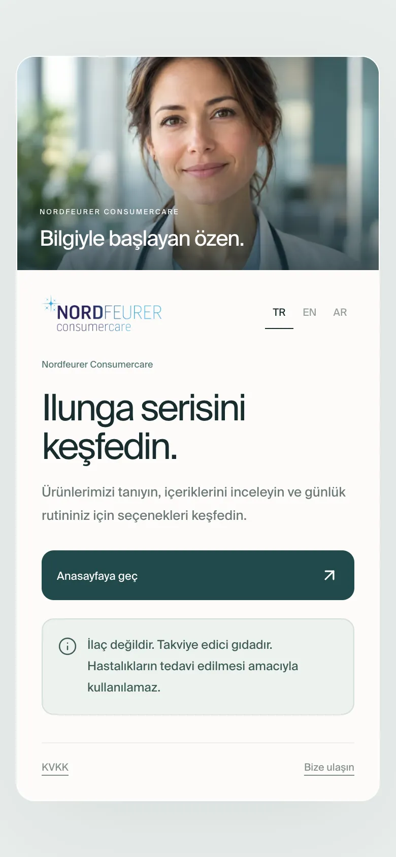
Explain the three Ilunga supplements openly, with contents and directions for use.
Our part
Web design, real-time 3D product models and a three-language setup.
Outcome
Ilunga Frau, Ilunga-F and Ilunga-M each have a page, with contents, use, packaging and contact in four steps, in three languages.
View Live Site→What we did
Client
Nordfeurer
Year
2025
Sector
Health
Web Design3D Web ExperienceMultilingual Setup

Nordfeurer

3D Product Experience

Need
Explain the three Ilunga supplements openly, with contents and directions for use.
Our part
Web design, real-time 3D product models and a three-language setup.
Outcome
Ilunga Frau, Ilunga-F and Ilunga-M each have a page, with contents, use, packaging and contact in four steps, in three languages.
Client
Nordfeurer
Year
2025
Sector
Health
Web Design3D Web ExperienceMultilingual Setup

Case story

How Nordfeurer came together.

  1. 01The challenge

    Photos struggle to show how a product opens and what is inside.

    Nordfeurer wanted its products to explain themselves on the web.

  2. 02How we solved it

    We turned the products into real-time 3D models on the web, with scroll-driven stories that open from box to capsule and live product cards you can drag to rotate.

    • Real-time 3D models
    • Scroll-driven product stories
    • Rotatable product cards
  3. 03The outcome

    The site is live in three languages.

    Visitors do not just look at the product, they turn it in their own hands.

  • 0languages
  • 3Dreal-time products
  • 0Lighthouse performance scoreGoogle Lighthouse, desktop · Nov 2026

Project film

The showreel

Watch the short film the Piyon Creative team produced for the Nordfeurer project.

Project scope

What did we do?

01

Corporate Web Design

A modern, fast interface that reflects the brand and looks right on every screen

02

3D Web Experience

Interactive Three.js scenes that draw visitors in

03

Multilingual Setup

Content infrastructure that reaches international visitors in their language

04

Mobile-First Design

Built mobile-first to work flawlessly on phones and tablets

05

Performance & Speed

Pages that load in seconds thanks to image optimisation and a modern stack

The build

The pieces in the library, the site on the canvas.

A depiction of the order of work. The colours, type and screens are the project’s own.
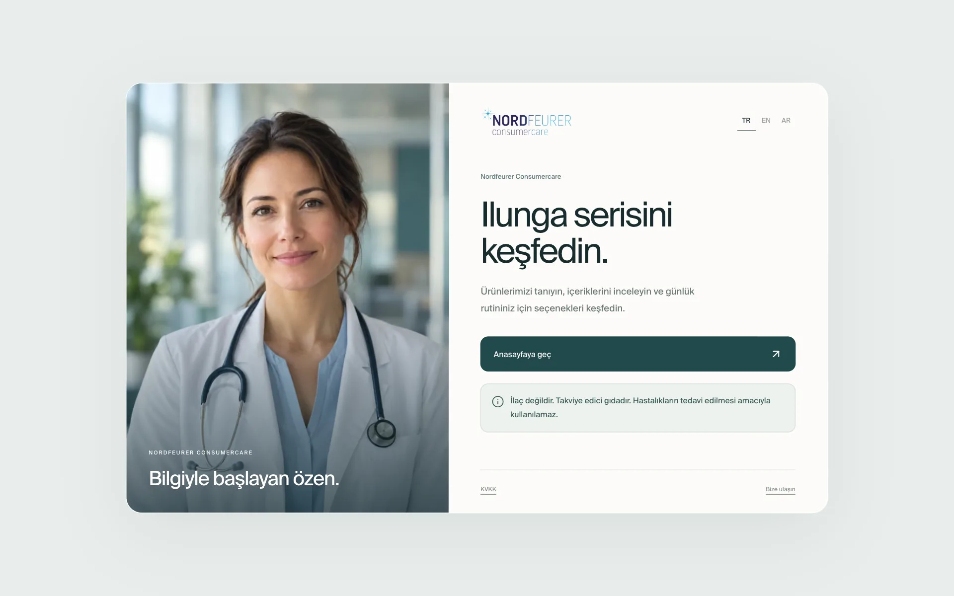
Perfect compatibility on all devices. The same quality experience on every screen with Piyon Creative.

On mobile

Nordfeurer
on the phone.

PIYON CREATIVE

Have a project in mind?
Let’s plan it together.

Explore our work
0534 896 94 20